As promised, here's some screen grabs and maybe even some clips of things that we have been putting together for Deep and Meaningless..!
This here is going to be what the animated background for when Deep is introduced. We're thinking of doing an opposite for Meaningless, so maybe a more jagged, colourful background will fit? We shall see.
We're going to be branding heavily on the polo theme, because it has that kind of surreal look to them, and I'm pretty sure that is what our client wants. A mix between an actual show, and an LSD trip.
This is going to be our end shot, which will then move into the actual show. I've made sure that it fits into all of the bleed lines, so that when it is moved over to the television we won't get any of that nasty-ness.
We want think kind of thing for the "Money Shots" that Val was talking about. We just need to find a way of getting from bringing them in, to this, then back again. But that's the fun really isn't it?
We've been talking to Val a bit more, and we have come up with using a 70's sort of pattern thing. For introducing Deep, I'm going to animate a 70's looking pattern to have the puppet wiggle onto. Ill do the same for Meaningless but with more variation. Val also wants what she calls a Money shot, in where we go from the patterns all moving, to just the puppet on a black background with their name. We're thinking that using the polo's for this is a great idea, and will keep with the theme. My next post will be some screen grabs of work in progress.
We had a meeting with Val, and gave the idea that I had, and it turns out she doesn't want what we have proposed! So it was back to the drawing board.. We through some more ideas at her, and she let us know what kind of thing that she wanted. We weren't so much given an idea, but with what she has told us, we have come up with an Idea. We are going to brand the show strongly on what she has already has some elements of. Val calls them Polo's. They are just thick round circles of colour. So we are going to get to mocking up some different parts.
We also learnt that the show will feature puppets called Deep and Meaningless. We have come up with a plan to feature introducing these two puppets in the intro, so first Deep, then meaningless, then we need to bring them both together at the end. More to come!
Okay Dokey! Me and Hayley Scanlon have been given the task to create an opening too Latest TV's Deep and Meaningless. Straight away we've had a few ideas. My big plan is to have everything set in like an old Punch and Judy set. This could be a tricky task, but using the 3d parts of After Effects, I should be able too put it off...!
Today we had a meeting with Val from Latest, and I got to show here what I had in terms of television Idents. She liked them, though they still need a little work. I was having a play with After Effects today as well, and have stumbled across a technique that can bring life into my idents even more so! I can film locations like I had planned to originally, but have found a much better way of making my 2D elements look as though they are part of the real world! Brilliant! Tomorrow I'm going to go out shooting again, and really get a good selection of different shots and areas, then get cracking on finishing my package all ready to hand to the Latest team next week! Ace!
THATS RIGHT. I've been shooting, and editing my footage! Its taking a lot more learning that i thought it would, but its certainly peaked my interest in After effects. I've had a few goes at it, and I think its looking pretty good. I think its good enough to show, but If I wanted it to be TV qualility, I'm going to have to pick my game up.
OK! So last week I had to pitch my ident ideas to Val from Latest TV, and I got the all clear on 3 of my ideas! I need to do a little research into filming permissions from the pier for my other idea, but by the sounds of what feedback I got, Val really liked what I had pitched! So thats good.. I did a few little animated mock ups for my ideas, so ill put them below..! I've just finished up the story boards for them, and they'll be bunged into my sketchbook when I can. The next step will be to find a camera, and start filming these bad boys! Then onto the fun of post editing..
Thought of a good idea for a title sequence for one of latest TV's programs, specifically "Deep and meaningless" After hearing that they used puppets, the first thing I could think of was a sort of punch and judy stage.. So I could make an animated title sequence, in where you go deeper into this puppet stage, and There could be clouds on strings, and animals on sticks and stuff like that.. I would also make it specific to the season that they're on, so I could have items that are specific to what they are going to be talking about, like love hearts, and star signs. Just a thought, but im going to roll with it.
Today we had a meeting with Val and Matt from Latest TV. They want us to create different visual elements that can be used for their new local TV station situated in Brighton. They were a little vague with what they actually wanted in terms of design choices, but it was pretty handy hearing what they ACTUALLY wanted produced from us. There are 3 programs that they want opening titles for. Deep and meaningful is a talk show, focusing on Astronomy, and aliens and all that. Matt's Bonkers Conkers, a comedy sketch show in and around Brighton, and Gate Crash TV, a vox pops style, punky, trigger happy style show.
They also wanted some idents for in between shows. I've had a quick look at some existing idents from other popular channels to try and get a sense in what is required in them.
This is one currently being featured on E4. It heavily features the colours that the channel has associated with the brand. Also the logo has been made the key feature towards the end, displaying it in the center of the screen. Its a very interesting piece of work, that would keep the audience engaged and guessing.
Here's another E4 Ident that is being used at the moment. Its a much different style than the previous one, but it keeps the same kind of style. It also keep the channel name and logo central is the idea of it.
The BBC have a different style, but at the same time, its kept the same idea as the E4 ones have, in where the channel name and logo are central to the design, and are the main focus point.
All the timings of these Idents seem pretty similer. They all kind of build up just to stop at the logo, as if it was saying this its all leading up to this, this is the be all and end all. Really big-ing up the channel. Which I guess is the point of an Ident really!
We had a pitch! And with pitch comes the inevitable criticism of the work! Don't get me wrong, I'm happy that this criticism comes, because It gives me another perspective on my design! So here is my crude list of things people suggested I changed..!
-Make the "or" smaller, or get rid of it completely, find another way to get the point across
-If your using the "or", make the shape the DE logo shape.
-Do some mock ups of different orientations, to show how it can be used in different formats.
-Move around the package shots, it looked really busy in the one I showed everyone.
With the brief that I was given by YCN, I was also given a packet of useful graphics that I can use for my design. This included the DE logo, and some product shots. Very handy indeed! I was also given a PDF explaining the branding guidelines. It pretty much told me that I shouldn't mess with the logo AT ALL... So I won't..!
Ive just started to colour in my design for my poster. I've still got some tweaks to do with the design its self, but its not going to colour its self, so I'd better get cracking!
Pitch is on Wednesday, So ive been working on getting something I can actually SHOW the class. Its looking good! Well, I think so anyway! Ive changed a few bits round. On my poster instead of just a plain kitchen counter with coffee on top, im going to try and mirror the busy coffee shop scene, but less busy, and in a kitchen.. If that makes any sense! So.. Instead of a brain dead barista behind a counter, theres going to be a smiley woman, with a kettle and a mug, and instead of a hand looking at a watch, theres going to be a hand holding onto a cup of coffee. Hopefully this will get across the big difference between the two, showing how easy instant coffee is, and how much of a faff going to a coffee shop can be. Thats the plan anyway! The whole mirror thing will be good, because hopefully that will draw the target audience in to see the poster! Ill put up a screenshot of my current wire frame that ive been working on!
Ive come up with two posters that I'm pretty pleased with, but I feel that they need to be incorporated together somehow... That's the part I'm struggling with at the moment. I'm sure it'll come to me, I just need to sit down and work it out. My first poster has a Barista behind a counter looking out of it, and theres a hand looking coming out of the bottom left with a watch on it, showing that hes late. Ive put some text in there saying "Monday morning rush" and the DE logo. Ive also put some products in there as well. This is in no way a complete thing YET, I still need to mess around with it.
My second idea was the same kind of layout, but ive replaced the Barista with a kettle and a mug.. Ive only got a wire frame of this so far, but again, its not the finished thang clearly, still need to play around with it all.
Ive had a chat with Chris, and Hes bought me back to giving the different perspective of the coffee shop and the instant. Im going to do one large poster, or i could cut it up into two different ones, but I'm edging towards one large one. On one side, I'm going to keep the coffee shop, where someones late, and having to wait for a long time for their coffee, and on the other side, someone sitting on a sofa, watching TV, enjoying a coffee, with bags of time to spare. I think this will work because its from one extreme to the other. It also fits in with the target audience that DE has given me!
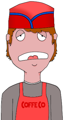
Ive been doing some sketches for the advert campaign, and I've drawn a cartoon Barista kid looking out of it. He is what it looks like all polished up!
I have had an idea. It came to me while I was starting my sketchbook. I had finished a few brain storms, and was just surfing the web, coffee related surfing, when I came across a proper barista coffee machine used in costa and starbucks and all that noise. I figured, "That would make some cool packaging!" So I think I can pull that off as a new campaign.. I could even draw up some adverts to go with it.. But we'll see how it pans out..!
I could even put mugs in it, with the douwe egberts logo! D:
We've been given a new project! And boy is it a doozy. We have to choose a brief from the list that the YCN have given us for the YCN student awards. Not only do we follow the brief, but we also submit it to YCN! Cool huh? I've had a read though all the briefs, and the one that sticks out for me is for Douwe Egberts coffee.
They want people to get excited about coffee at home, rather than at coffee shops. So I have to create an advertising campaign, or a new product for them, that pushes this idea. I'll get back to you when I've had a brain fart for this..