Another project aye? A week to do the bulk of it aye..?! Well... Here we go..
Brief:
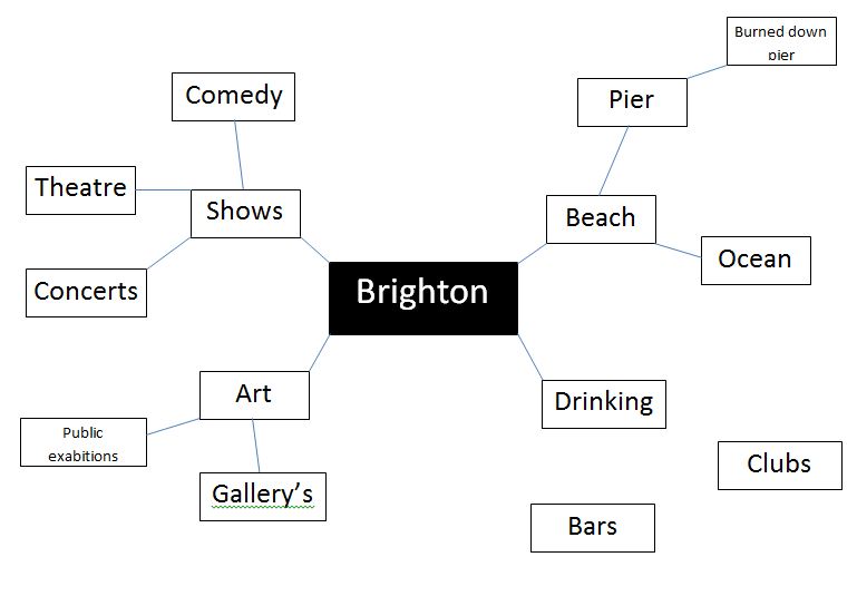
Inner cites changed
enormously in the 90s and 00s, with run down areas of disused buildings and
land, and in some cases substandard housing, being redeveloped into pockets of
urban cool, featuring flats, shops, hotels, restaurants, venues and conference
centres, with the intension of breathing new economic life into the previously
derelict. In Brighton, two
examples of this are the area around the Jubilee Library and the New England
Quarter at the back of the train station.
Further afield, the work of Urban Splash has redeveloped areas of
English northern cities.
This kind of regeneration has
slowed right down in the current recession, but for this assignment you have to
imagine that London Road Brighton is being redeveloped into a gentrified urban
centre attractive to the young and single or couples without children. Flats, bars, restaurants, shops, a
hotel and a club / music venue are designed to be attractive to the target
market of 18 – 39 year old well off students and professionals.
You have been commissioned to
create the graphic design for the promotion of the London Road Brighton
project. You need to develop a
consistent visual language across a range of print pieces, using typography and
a graphic style in a way that creates a visually coherent campaign. You need to produce a folding leaflet
which promotes the project overall combining text and images, and a series of
at least three magazine ads or posters which focus on a specific aspect of
what’s on offer in the zone (such as a bar, the hotel and the flats). The ads are for distribution as full
page ads in relevant magazines including Time Out in London and Latest 7 in
Brighton. The posters are to be
placed in London and Brighton bus stops and train stations, and London Tube
stations. You will need to create these
print pieces at suitable aspect ratios and mock them up into a photo of a
location or magazine to show their impact in situ.
You will start this project
by undertaking visual research. As
well as looking at existing posters, magazine ads and leaflets for their design
characteristics, you will look into the visual presentation of architectural
and urban regeneration projects, and you will also explore the work of artists,
designers, design movements and images to select a visual language that will
inspire and inform your work. This
research needs to be reflected in your blog.
You will devise the concept for your campaign
(inspiration, imagery, tag line, colour, font, layout etc) from research and
design development processes including brainstorms, mood boards, sketches,
mock-ups etc and pitch this concept to the group and your
tutors for discussion. Your design
development work must be shown in your sketchbook.
You will use any combination
of Photoshop and Illustrator to produce the artwork for this project. The leaflet must be laid out and typography
incorporated in InDesign.
You will show your completed artwork to the
group for critique, justifying your design decisions and looking for potential
improvements. The crit feedback
needs to be written up on your blog.
Once improvements have been made in response to the crit, you need to
print your artwork to put in your sketchbook. These do not have to be printed at full size for the poster;
you can print at A3. The leaflet printed
double sided and folded. You need
to get your printing done externally at a print shop (Blow up in Brighton and
The Print Room in Lewes are recommended).