
Friday, 30 March 2012
Its coming along.
Ive been working with my CSS for a while now, and it is really coming along. We got a few pictures and a bio from Clive, which made me change some of my initial plans. Ive changed the header and navbar font to fit better with the font on the building its self. Ive gone from Harabara (http://www.dafont.com/harabara.font) to COUTURE Bold (http://www.dafont.com/couture.font). I am now playing around with different styles to get this working. HOPEFULLY he will send us a logo, because then I can work around that. Below is a picture of the index with that I have so far..!

Sunday, 18 March 2012


Fonts
Ive been looking around on the internet for effective, simple fonts that look good with what I have in mind. After a long time scrolling through Dafont, i found this font called Harabara
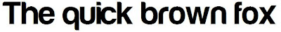 I like this because it is simple, but pretty classy at the same time.
For the website body font, i needed a web friendly font, and for that I went to google webfonts.Having chosen my heading font, I wanted one that fitted well with Harabara, and I found one called Doppio One.

For the website body font, i needed a web friendly font, and for that I went to google webfonts.Having chosen my heading font, I wanted one that fitted well with Harabara, and I found one called Doppio One.
Friday, 16 March 2012
Colour scheme idea.
We asked the client about the colours that they wanted in this website, and they said "Red, black and white are our standard colour scheme" So I put together this one. There is a white at the end of this one, but It won't show up on this.


Content brainstorm.
Here is a very brief brainstorm for the pages I will need for this site. As the client doesn't want a lot out of this site, there are limited pages, as they wanted.


Wednesday, 14 March 2012
Domestic appliances - Other websites.
Because I am making a website for a domestic appliances company, I have decided to look at websites that currently stock those things, to see if there is a popular theme with them, and whether they all stick to some kind of rule. So, I first looked at the Bosch website.

This site is very white, and very clean. Everything seems to be alligned right. This may be because people who are shopping on this site, want clean and orderly because it is for their home. The navigation was pretty simple, you could get mostley everywhere from the index page, and the nav bar being blue helps it stand out from the rest of the white.
The next site I looked at was Rapid, in Liverpool.

Again, you can see that white is used a lot, and the parts that they want you to see instantly, are a very stand out colour. Having the header dark, and the navigation a different colour helps the customer to see where it is they are going, because this isn't a kind of website you could just sit and browse at 4 in the morning because you can't be bothered to go to bed, you come on a site like this because you want something specific, and a well laid out navigation bar can help you achieve what it is you are looking for.
Lastley, I looked at Gillamans.

It is the same story here it seemed. White content, with a stricking navigation bar.
This has definietly helped me start to formulate a plan for my own site, given the nature of what is going to be put on the site, and what the target audience will be looking for.
Sunday, 11 March 2012
Domestic Appliances
The brief that I have been given is for Clive Arnold with Domestic appliances. He is looking for a simple 3 or 4 page website. The brief tells me that he has had the business for 23 years, and that they supply and replair domestic appliances and white goods. This isn't a webpage for selling things online, but an infomation site that will hope bring people into the shop.
Tomorrow we are meeting with the client, so I am going to ask them questions, so that I can narrow down what it is that he wants.
1) Can we have a brief history of the place?
2) How many people do you employ?
3) In terms of target audience, what age do you mostely see in your shop?
4) What is your biggest seller? Both in terms of repairs and sales.
5) What are your guidline prices? Like, how much for a repair, and sale with certain items.
6) How would you want your website to show you as? For example, professional and business like, or professional and friendly.
7) Do you have a logo and slogan already?
8) Does the shop have any redeeming features? As in, if someone who new the shop and looked at something, would it remind them of the shop?
9) Do you have a primary colour scheme for your shop front?
10) What feature would you like more of on your website?
11) Will you be wanting an part of the website where customers can purchase items?
12) Are there any extras you would like ontop of everything else? Such as a products page to display prices, or a rates page to show how much repairs are?
Friday, 9 March 2012
So many briefs, so little time..
I have just received three briefs from real life clients looking for websites. The first one I was was for a children's nursery called PACES. Seems they need a website for general information, prices, staff, and all that. I suppose it would have to be a pretty simple website, with soft colours and easy to read fonts, as it is for adults looking for a place for there children.
Another brief we have is for a group called Self made creative clothing. What THEY do is to help people of all ages learn new creative tasks, and how to be entrepreneurial. They do this by getting cheap materials for the students to create things out of, and sell them for a profit. "In the medium term, learners have the opportunity to further enhance a range of skills from presenting and project management through to fashion marketing and hand-made manufacturing."
The last one I read was for a business called Central Appliances. What THEY do, is supply, and repair appliances, mainly white goods. (Fridges, freezers, microwaves, radios) This was the shortest brief.
We are meeting the clients on Monday, so I will have to make sure I have ready a buck load of questions for them, so i can build up a small portfolio of what each of them want. Good plan.
Friday, 2 March 2012
New Project... SOON!
We have JUST been told that our new project will be about web design. So, coding and all that. I'm looking forward to that! George has just also asked for some examples of good and bad websites. So lets start!
1) Google. (Good website)
Google is a great example of a really well made website. Simply because there is nothing there! All that you can really do on Google is search the web. I mean, they HAVE added a lot more, like maps, and docs, and mail and Google+, but other than that, it is such a simple design, and is REALLY simple to use. A website is successful if the user instantly knows how to use it, just by looking at it. I mean, navigation bars work to an extent, but you want to be able to get everywhere from one page, and Google is a perfect example of this. Mainly because you can get anywhere on the web FROM Google..!
2) Sixties press. (Bad website)
Wow. Just wow. I mean, this website LOOKS as though it was made in the 90's, but this was voted one of the worst websites of 2011. Where do i begin? For one, everything is placed down the left side, making the site feel trapped, and restricted. It makes you want to leave instantly, before you've even read anything. The subject matter is all about healing, and being spiritual and all that silliness, so you can see what they where trying to do when they made this site. They wanted it to be vibrant, and trippy, and psycadelic. But they failed. It just looks really dated. And not the good kind of dated, but the bad, "Wow that looks old and creaky" rather than "Wow! Thats retro so its cool!"
Using the navigation bar is pretty simple, like, you can get to all the main pages from every other page, so I suppose thats one point to Sixties press. But every time i go to a new page, the website darts about. This shows that it wasn't anchored properly, or even /div'ed properly. It looks as though someone made this site on notepad.. Which im sure they did.
Last minuete Changes.
Last night, while at work. I spent my time tweaking my final project. Ive added a few more text elements to the piece, and well as tightened up some of the cuts, so that it really flows. Today is hand in day, and I THINK I have everything. I few more bits and bobs might need doing to the sketch book, but I'm pretty sure thats about it...
Subscribe to:
Comments (Atom)