For my user testing, I gave my iBook to fellow student Hayley Scanlon, and she had this to say:
"All the links work really well, and it was all together very easy to navigate round. The usability was very simple, which didn't make me confused about how I work it. A few things I would say about it, would be that it seems that some of the backgrounds dont match up enough. Maybe you just need to re size them? The animations work well to show what is being said. All together, it works well."
So thats good! If I have the time today, Ill change the sizes of my background..!
Wednesday, 12 December 2012
Monday, 10 December 2012
Heres my final animations! Enjoy!
At last! After 2 and a bit months of work, I have finally finished this project, to a level of competency, I hope anyway.. I like It, but I guess its not up to me now is it..! Here is my final set of animated films.
Opening:
Scene 3:
Scene 4:
Scene 5:
Opening:
Scene 2:
Scene 4:
Scene 5:
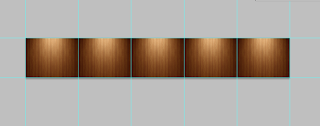
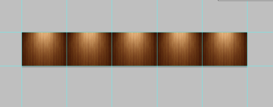
A little change of iBook design.
I have changed the look of my iBook design once again, this time I'm really happy with it! I've added thumb nails to the contents page, and I've made a new background for my different pages, so now they all look like a continuous 35mm film segment, with the different movies in the center of the frame, corresponding to the page its on.


Sunday, 9 December 2012
These things I used.
OK! So heres what I used during this project..
PHOTOSHOP:
I used photoshop to edit various images so that I could show what I wanted. I also used it for making the contents page, and the backgrounds for the scrolling. Its a perfect tool for creating images either from scratch, or fixing images to suit your needs! But you all know that really don't you?
AFTER EFFECTS:
This was the first time I used After effects, and It took me a little while to get into it. I did get into it eventually, with the help of Chris, and getting the hang of using Key frames. Key frames have pretty much saved me on this project, and its amazing the things you can create with them. Ive learned a great deal about after effects in this project, even a lot of things that I haven't used, which I plan to use on my own home projects to buff up my skills.
Fun times aye?

All done!
Hot damn! got it all finished! Ive made my own navigation for the iBook, using an image with links. There are a few more bits i need to do on monday, which I havent learnt how to do yet, but that won't take too long. Now im just polishing up everything, making sure it all works well!
Wednesday, 5 December 2012
Review of crit
Crit was relatively successful this time round. There wasn't too much said. The main issues that needed to be seen to was a few resolution issues of the images. I have now sorted that by not just finding new images, but taking them my self! It seemed a lot easier to do than trying to improve the crappy ones. I have also improved the navigation, which has made the whole thing a lot more user friendly, and easy to navigate round. Apart from that, It was pretty positive feedback! People seemed to enjoy my animations, and it had a clear message.
Friday, 30 November 2012
Final cutting and all that
OK! I have just finished exporting all my animations from AE to movs, and am in the process of cutting them all together in Final cut pro! I have had a slight snag that is stopping me from doing anything.. I don't have an up to date mac, so I can't get iBooks author into it, so I'm going to have to work my arse off on monday putting it all into an iBook. I should be ok..
Saturday, 24 November 2012
Maybe a little bit too much?
Turns out I was a little enthusiastic when I got my voice interviews.. I have like, 12 different ones, most of them over a minuet long, so I'm going have to pick and choose. I think I'm jsut going to use 6 of them, and include all the other ones and bonus material for the iBook.. Seems like a bit of a cop out, I know, but when you got it, use it. Why not?! Other wise its all just a bit wasted..!
Thursday, 15 November 2012
Animated Documentary
Animated Documentaries have been around since animation has been around. One of the king pins of early animation of course were Disney, and since they always have their fingers in ALL the pies, of course they had to make documentaries too! This particular one that I have found was made in 1957 for Disneyland, to teach children about the power of the Atom.
This uses a good mix of live action film, and animation to get its point across. It shows that animation is a good way of showing something that you otherwise wouldn't be able to. Of course this isn't the best example to use, but to understand animation, its best to know where it came from, and Disney have been the masters since the beginning.
I found a new example of an animated documentary that is a lot more suitable for my needs. This is called "Faith" by Youtube user Tiddojr. I think it shows what you can use new software to create, and how you can use animation to accompany a spoken story. I really like the book theme that's been used, and how effective its been used for the purpose of a documentary.
Sunday, 11 November 2012
Its getting better all the time.
Ive been doing non stop animating! Ive had a few changes. a font that ive been using is Poplar Std, but that could again change all over when it comes to finishing touches and editing. I havent yet actually put it all into an iBook, but I want to get all my scenes finished before I get into that. I should have enough time for that too.
My iBook folder i huge now, with currently 4 different subfolders for each scene, By the looks of it, if i manage to finish and use all my interviews, im looking at over 8 different scenes, possibly ten!
My iBook folder i huge now, with currently 4 different subfolders for each scene, By the looks of it, if i manage to finish and use all my interviews, im looking at over 8 different scenes, possibly ten!
Friday, 9 November 2012
Time Schedule
Here are my time schedules! I have colour coded them, so I'll have to write out a key.
Green: Getting to grips with the software
Yellow: Getting my voice interview
Red: Planning animations
Blue: Animating
Purple: Cutting together animations
Pink: Making the iBook
Orange: Finishing up.
Also, I planned to blog and sketch a long with it all, so I didn't include that.


Green: Getting to grips with the software
Yellow: Getting my voice interview
Red: Planning animations
Blue: Animating
Purple: Cutting together animations
Pink: Making the iBook
Orange: Finishing up.
Also, I planned to blog and sketch a long with it all, so I didn't include that.


Sunday, 28 October 2012
Animating like a mad man.
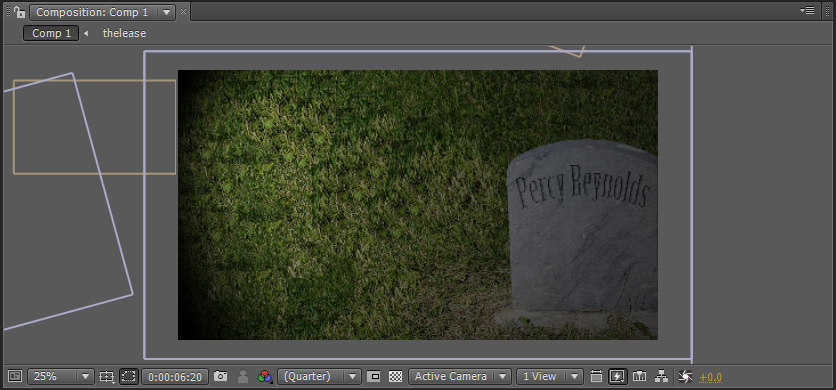
I've been animating like a think possessed lately! And its really coming together! I've managed to get my hands on the original 1958 lease for the Cinema, which is very cool, and has made a good contribution to my work, using it as an element! I think ive finished my first scene! Just need to crack on more and get the rest done before i can start editing it all together. Over and out.

Snazzy aye?
Snazzy aye?
Wednesday, 17 October 2012
Its all coming together
OK! Ive finally got all my voice interviews, Ive got my hands on a copy of After effects CS4, AND audition, so I just need to story board the whole lot, get all my elements together, then start my animation! I have WAY over 1 minuete of voice interviews, but each of them are either just over or just under a minuete. Im really happy with the quality of my recordings, and the infomation that I have gotten out of my subject. My only major problem is that we have almost no pictures of the cinema from the 60's. The only two photos ive managed to get hold of, of the building, are from 1988. You can tell the year brilliantly with these photos, because of the films that are out.

They required a little bit of doctoring, but other than that they are really good pictures! I also managed to get some pictures of my Granddad, the man who bought the place off Percy Reynolds. We don't have any pictures of Percy though, which would have been really good.
 Its the Markwick charm really isnt it?

They required a little bit of doctoring, but other than that they are really good pictures! I also managed to get some pictures of my Granddad, the man who bought the place off Percy Reynolds. We don't have any pictures of Percy though, which would have been really good.

Tuesday, 16 October 2012
Whats that noise? (Just a short one)
Ive found this great site that will come in handy for my iBooks project! Its Freesound.org. Its a massive database of free to use sound bites of almost anything! So far I have got an old 35mm projector sound, some crowd noise and a shush noise! Brilliant!
Monday, 15 October 2012
Story BOARDING
Ive finally started to storyboard... Which is good! Today ive managed to polish off my opening segment! By the looks of it, its gunna need some work, but Ive got enough to be able to pitch an opening next week to the gang. I had a little play with After effects also, so Ive got a rough animation that i can use for my pitch next week, so that I can give a rough idea of what it is that I want to have created by Christmas. I should be getting my voice interview tomorrow morning. Everything seems to have gone against me getting this damn thing! Mainly my subject leaving the country... Then going to London film festival.... and It being his birthday over the weekend.... BUT never the less, tomorrow morning I shall have it, then I can story board how i want it to go, then finally start my animating! I hope..
Sunday, 14 October 2012
You know I got questions.
I've been having a think of what I can ask my father abojt the history of the cinema, and I think I've come up with some good ones! Once my interview Is done, I can finally start animating! Ad I cannot wait to start!
Questions for IBook
Questions for IBook
What is your earliest memory of the cinema?
When did your dad buy the cinema, and who off?
When the family bought it, what changes had to be made to the place?
Has it always been a cinema? Do you know much of the history?
How long have you been working here?
What was the most difficult time you can remember for owning a cinema?
When did it start to get better?
What was the highest grossing film that we've had here, ad how well did it do?
How have you kept a float while other independent cinemas have gone bust?
Do you find it difficult competing with the multiplexes?
What is your best memory of this place?
What is your worst memory of this place?
How did you cope with the transition from film to digital?
Do you have any major plans for the future?
If you could do anything to the building, what would you do?
Monday, 8 October 2012
iBook story idea.
Its not concrete just yet, as I need to have a talk with my father. I'm thinking I do a brief history of the Cinema that we own. All I know about the history of it, is that we bought it in 1961, and my dad took it over after my Grand pappy died. I guess the history of it will focus on how we kept it going, while other cinemas were crashing and burning under the presure of customers. I can end on us expanding into not just films, but live streamed theater and ballet/opera, and even live comedy nights once a month.


In terms of animation style, I was thinking of a Terry Gilliam look, like he did in Monty python.

Tuesday, 25 September 2012
Back to the old freezerino's
We're back and more second year..y..er... than ever! On out first day back, we had to give a presentation on an aspect of our networking opportunity. I gave a little speech about Yves Peters, a man i saw talking at Reasons to be creative..!
We were also given out first project! And oh boy its a big one! The brief says that we have to create an iBook for the iPad, but It needs to be interactive, with elements of animation. But the topic HAS to be something to do with family history! At first I was worried, but I have decided to do mine on The Uckfield Picture House. I don't know TOO much about the history of the place, all i know is, that its a purpose built cinema, made in 1916 to raise troops moral.
To do this, I'll need to dive into town archives, maybe Pathe footage, and talk to the family about it, as we got to own it in 1961. Lets hope it all works out!

Monday, 11 June 2012
Lightbox.
Ive decided to add the Lightbox feature to my site. I will use it on the art portion of the site. Here is what it looks like.


The little elements.
Here are my little elements of my site!


Nav button:
Header and footer:
Email address (will stay with the footer)
Change of layout.
Ive decided to change my layout, due to the image size that i am working with. Because i am working with individual pixels, ive decreased the window size of the content. It is still perfectly visible. I am also keeping the long header and footer, and decided on floating buttons for my navigation.


Layout plans.
I have currently two ideas for my layout. They are both very simple, but i cannot decide which one to go with.
 This first one has a restricted header and footer, with a large area for the sliding action to take place, and a fixed, hanging navigation bar.
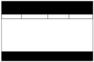 This second one is very similier, but the navigation isnt hanging over the slider, and the header and footer are at 100% width.


Layout options.
The way my idea will work, is by creating a jQuery slider. I have two options. I can either have a Horizontal, or a Vertical slider.


If I choose to go Vertical, then I will have to think of a way of shaping my idea into a design that works for that. That would mean changing the idea i had initially. If I did go with this, then I could make it look like an old scroll shooter, like a 2D Starfox.

I'm going to stick to the horizontal layout, because it stays with the way that i want my site to look like. If i was making a site with more than one page, then i could incorporate both styles into a site. I think this is something i should look into after the project.
Sunday, 10 June 2012
Fonts and Favicon
FONT
For the header, Ive used a font called Origami Mommy Regular
I found code online to allow me to have a favicon on my site.
Monday, 28 May 2012
Its getting better all the time.
Ive been working on this coding for a while now, and have not managed to get my head around Jquery until now! Its all pretty simple, it just requires you to learn what each part of it means, just like a new language. Im having fun working the whole puzzle out, and I have just managed to get my sliding on the page to work. My next task is to work on all the content. Adding links, and light boxes and all of that. Ive had to be very precise will my measurements, but whats great about this is it doesnt all have to be equal, you can experiment with different numbers, and equations. Oh its so much fun!

Tuesday, 22 May 2012
Drawing with pixels
Its very tedious working with pixel art. drawing an image pixel by pixel takes time, but can come out looking very good. Ive created a few different scenarios, but they arn't ready yet. The sci fi area, which i hope to be the about bit is coming along.

Monday, 14 May 2012
Sprites
For my site to work, I need to be able to create animated sprites that make it look more like a game, than a website. I have knocked up a little sprite for the man that will be running through the site along with the user. To do this, i had to create 3 separate images, and using Photoshop, create a short, 3 frame animation that make it look as though he is running. HOPEFULLY the Gif will work on blogger..


Also, here is one of him using something.

Friday, 11 May 2012
My idea..!
The idea for my website I got while playing Legend for Super Nintendo. I figured, why can't I make a website that looks like a 6 bit video game? I have been working on a few designs for it, and have made a little character to accompany my site. Look style I'm going for is very pixely, but in now way restricted the same way 16 bit was.


Saturday, 7 April 2012
Been learning.
Been fiddling around with CSS for a while now, and I'm REALLY warming to it. Very much enjoying working it all out, and seeing what works with what. This is just to check in, to show I managed to get scrolling within a div! very useful!


Friday, 30 March 2012
Its coming along.
Ive been working with my CSS for a while now, and it is really coming along. We got a few pictures and a bio from Clive, which made me change some of my initial plans. Ive changed the header and navbar font to fit better with the font on the building its self. Ive gone from Harabara (http://www.dafont.com/harabara.font) to COUTURE Bold (http://www.dafont.com/couture.font). I am now playing around with different styles to get this working. HOPEFULLY he will send us a logo, because then I can work around that. Below is a picture of the index with that I have so far..!


Sunday, 18 March 2012


Fonts
Ive been looking around on the internet for effective, simple fonts that look good with what I have in mind. After a long time scrolling through Dafont, i found this font called Harabara
 I like this because it is simple, but pretty classy at the same time.
For the website body font, i needed a web friendly font, and for that I went to google webfonts.Having chosen my heading font, I wanted one that fitted well with Harabara, and I found one called Doppio One.

For the website body font, i needed a web friendly font, and for that I went to google webfonts.Having chosen my heading font, I wanted one that fitted well with Harabara, and I found one called Doppio One.
Friday, 16 March 2012
Colour scheme idea.
We asked the client about the colours that they wanted in this website, and they said "Red, black and white are our standard colour scheme" So I put together this one. There is a white at the end of this one, but It won't show up on this.


Content brainstorm.
Here is a very brief brainstorm for the pages I will need for this site. As the client doesn't want a lot out of this site, there are limited pages, as they wanted.


Wednesday, 14 March 2012
Domestic appliances - Other websites.
Because I am making a website for a domestic appliances company, I have decided to look at websites that currently stock those things, to see if there is a popular theme with them, and whether they all stick to some kind of rule. So, I first looked at the Bosch website.

This site is very white, and very clean. Everything seems to be alligned right. This may be because people who are shopping on this site, want clean and orderly because it is for their home. The navigation was pretty simple, you could get mostley everywhere from the index page, and the nav bar being blue helps it stand out from the rest of the white.
The next site I looked at was Rapid, in Liverpool.

Again, you can see that white is used a lot, and the parts that they want you to see instantly, are a very stand out colour. Having the header dark, and the navigation a different colour helps the customer to see where it is they are going, because this isn't a kind of website you could just sit and browse at 4 in the morning because you can't be bothered to go to bed, you come on a site like this because you want something specific, and a well laid out navigation bar can help you achieve what it is you are looking for.
Lastley, I looked at Gillamans.

It is the same story here it seemed. White content, with a stricking navigation bar.
This has definietly helped me start to formulate a plan for my own site, given the nature of what is going to be put on the site, and what the target audience will be looking for.
Subscribe to:
Comments (Atom)